Rachael Maniord
Product Management & Design Leader

The Problem
User Feedback
When developing the cashless digital tipping solution OnTheMonee ( see OnTheMonee App & OnTheMonee Portal) initial research with restaurant venues and employees showed that employees wanted their tips to be treated as cash and not linked to their main bank account. It was decided to not include transfer or ‘cash out’ functionality in the MVP product offering initially. However, after several months in market the feedback from employees was universal that OnTheMonee needed it (particularly for higher tip earners - >$1,000.00 a week).
Assessing ‘cash access’ options
Several solutions were considered to allow cash access from the OnTheMonee program, all with cost/risk/regulatory implications needing to be revisited before any technical build.

Considerations
•Cost & Overhead
•Capabilities / features
•Integration requirements
•Compliance/risk updates to the OTM Card
Due to the effort, cost and overhead to manage plastic cards ATM & Cash-Out options were quickly discarded. Limitations around NPP payments also made this option unfeasible. Direct Entry (DE) was the recommended solution and payment providers were explored. The decision was made to go with Direct entry (A method for making electronic payments. It facilitates transfers between bank accounts, including payments for salaries, direct debits for bills, and consumer "pay anyone" transfers.)
Deciding on a payment provider

Considerations
•Tokenisation essential for compliance
•commercials
•technical considerations / integration requirements
OnTheMonee’s card issuer does not currently facilitate DE payments therefore an integration into another payment provider was needed. After careful analysis it decided that Manoova would be the best partner.
Solution
Allowing Direct Entry requires us to perform a Know Your Customer check (KYC) on every cardholder, and for us to develop new terms and conditions for the program. Our intention is to make it available to all cardholders but to make it an opt-in process, so our current UX for OTM remains the same and customers that want cash access can then request it and go through the KYC process.
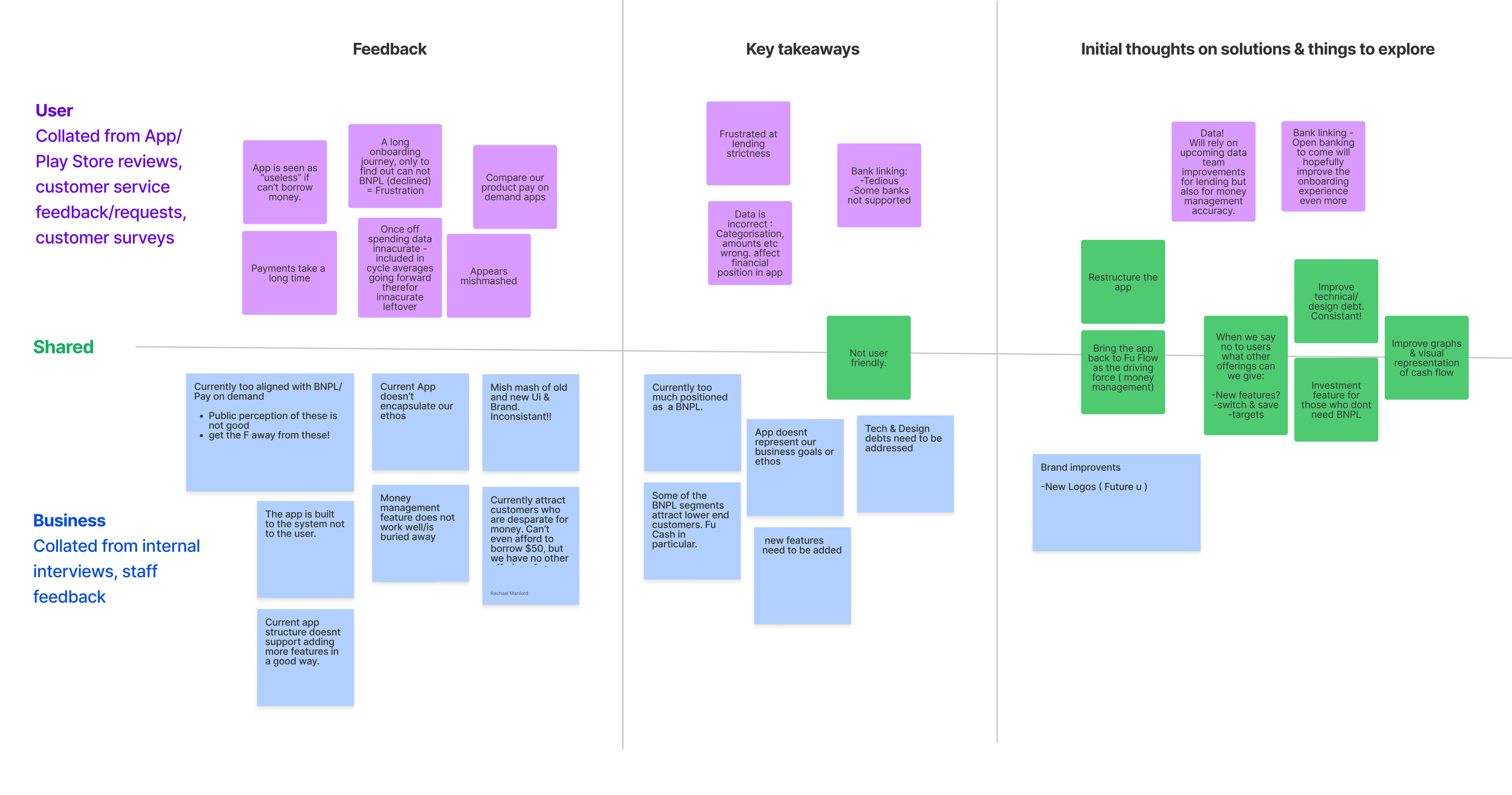
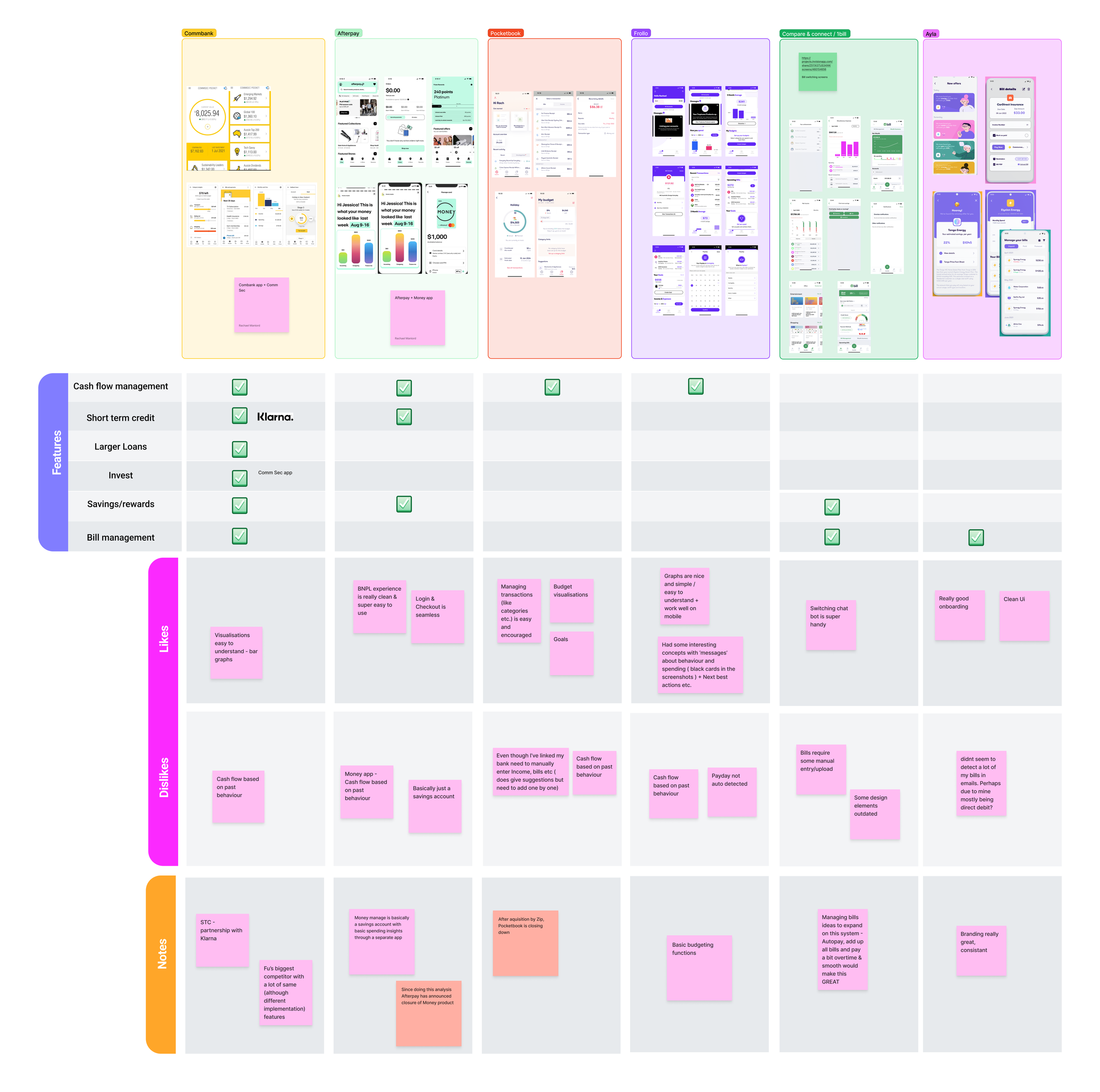
Competitor Analysis
Fu’s competitors consist of a number of Banks, Buy Now Pay Later Companies and Fintechs.
Summary of findings
Overall the competitors apps UX/UI have a bit of an edge on Fu’s current app, having more seamless experiences and up to date UX/UI.
In terms of functionality not much has changed since Fu’s 2019 (See Flow) analysis of the products. The personal finance management tools are traditional budgeting products and backwards looking. Buy now pay later (BNPL) still remains largely for retail with larger lending amounts.
Data Driven personas
According to customer surveys & data analysis of our membership base, Fu has three main user segments. They are grouped by their financial position (What Fu calls “Affordability”): Low, Medium and High. Each user will have different needs and will want/need to access different features to manage their cash flow.


Developing a Product overview - Features
Given the three main user segments above having very different needs, We posit that it makes sense for the driving force of the app to be centred around Flow and the actionable insights are surfaced contextually based on the users needs at the time.

Information Architecture
Planning the app structure.

MVP - Design Phase 1 (In-Progress)
With such a large undertaking at hand to not only ‘re-design’ the Fu App, but also add more features, it was decided that the main focus initially should be the Home Tab & Money Management Tabs (Flow + actionable insights). These are essential to address the issues faced with the current product and would be able to be broken down into small development phases and releases.
It was essential when thinking about these screens to utilise what we have (with improvements based on my initial research) but also to think about a design that will work with Fu’s current feature set and have the ability to add more. I.e. One new feature is to Invest spare money which has not been developed yet.
Starting with wires
Initial wireframes were developed to present across the wider product team + key stakeholders to make sure we were all aligned with the new vision for the app.
Design V1 (In progress)
The Home Tab
Users immediately see their financial position for their current and next three cycles. Immediate actions can be taken based on this position which include borrowing small amounts of money, finding savings, investing extra cash etc.

My Flow Tab
This is where users can see a further breakdown of their financial position, and start to build a bigger picture of their money: Which cycles are going to be heavy on bills. Where can I maybe save a bit? Did I actually spend that much last week?!
Users can:
View past and future cycles
View and manage their bills, income and spending
View and manage transactions
Set/track spending targets
Events & Transactions
These are the details of Bills, Income and Spending transactions. If Fu hasn’t got it quite right users can recategorise and edit them. They can also manually add a transaction to an event or create a new bill/payday.
What’s next?
Continuing to develop all of the different states and flows of the first two tabs & developing a testing framework to run some initial usability tests to test and learn from these initial designs.
Some initial things to explore:
Does the language used around the app make sense. i.e Flow, leftovers etc.?
Do users understand their financial position from the information displayed, and is it helpful?
Overall is it easy to understand (It’s pretty complex and trying to achieve a lot)?